Time for some design trend analysis. This started as a small observation of a certain car, but as usual the observation seems to apply to so many new cars this post has expanded hugely. Trends spread fast in the automotive design world, and when one large corporation owns many brands it can infiltrate across the range very rapidly. In 2014 VW showed some design concept cars that exaggerated a styling theme developed by more than just their own brand. Then in 2015 we have seen ever more extreme versions, but Audi seem to have slowly grown into this particular theme, only to abandon it perhaps with their latest styling statement. Brands such as Infinity and VW are using it to maximum effect, but who did it first? The usual answer applies here and that is BMW of course. Let us start to analyse the technique I am writing about.

The VW Cross Coupe GTE concept displays a large number of pinched feature lines among it’s surfacing design. Around a similar time, a chance encounter with a new model VW Passat spurred my interest in this design detail. I noticed that the Passat had a very pronounced pinch shaped feature line, but the Cross Coupe has 4 of them along the front wing!

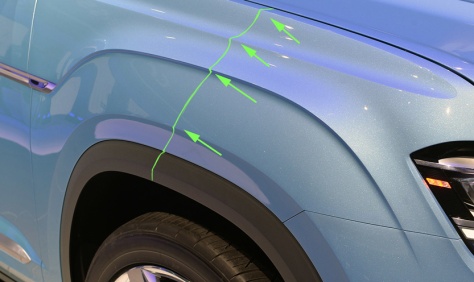
So this got me thinking about the history of this feature, about it’s function. The technology involved is fairly new (in car design terms) and involves a deeper draw for the steel stamping tools that make car panels. The stylistic function is to create a shadow, and of course a strong highlight, to clearly define the shoulder of the car. The reason this feature has become popular I believe, is because cars are getting larger and customers demands are for more interior space. Cars must be packaged to be squarer (with less 3D form) but aesthetic demands are high and customers want drama, speed or just that difficult to pin down “sportiness”. A blocky shape gives limited scope to “sculpt” the surfaces inwards, to design broad shoulders. Any angled surfaces reduce interior space, or make a car wider (too wide). Good car styling has come to rely on great light/dark contrast. A flat sided car panel does not offer this. Early days of using an undercut gave a subtle clue as to why this feature has made a comeback. A VW Passat is a great example as it has class leading interior space, simply huge, but has fairly ordinary external dimensions. To maintain a pleasing design, the designers must deploy some tricks.
BMW established a long tradition of very handsome saloon cars, the E28 5-series is a great example. On this car we can see a small, but very effective undercut. This is the early days of the pinched bodyside feature. It gives a nicely angled (to the sky) upper shoulder, with a shadow emphasising the lower bodyside, and of course a strong horizontal feature that lengthens the whole car, adding elegance.

Fast forward 20 years or more, and BMW under Chris Bangle really set the formula for current car design, so of course the revival and exaggeration of that undercut began with his BMW 1-series of 2004.

This has been much copied… but let us move along to where we are now, with the help of Audi and their slow evolutionary approach to design. This helps us see progression, in one vehicle.
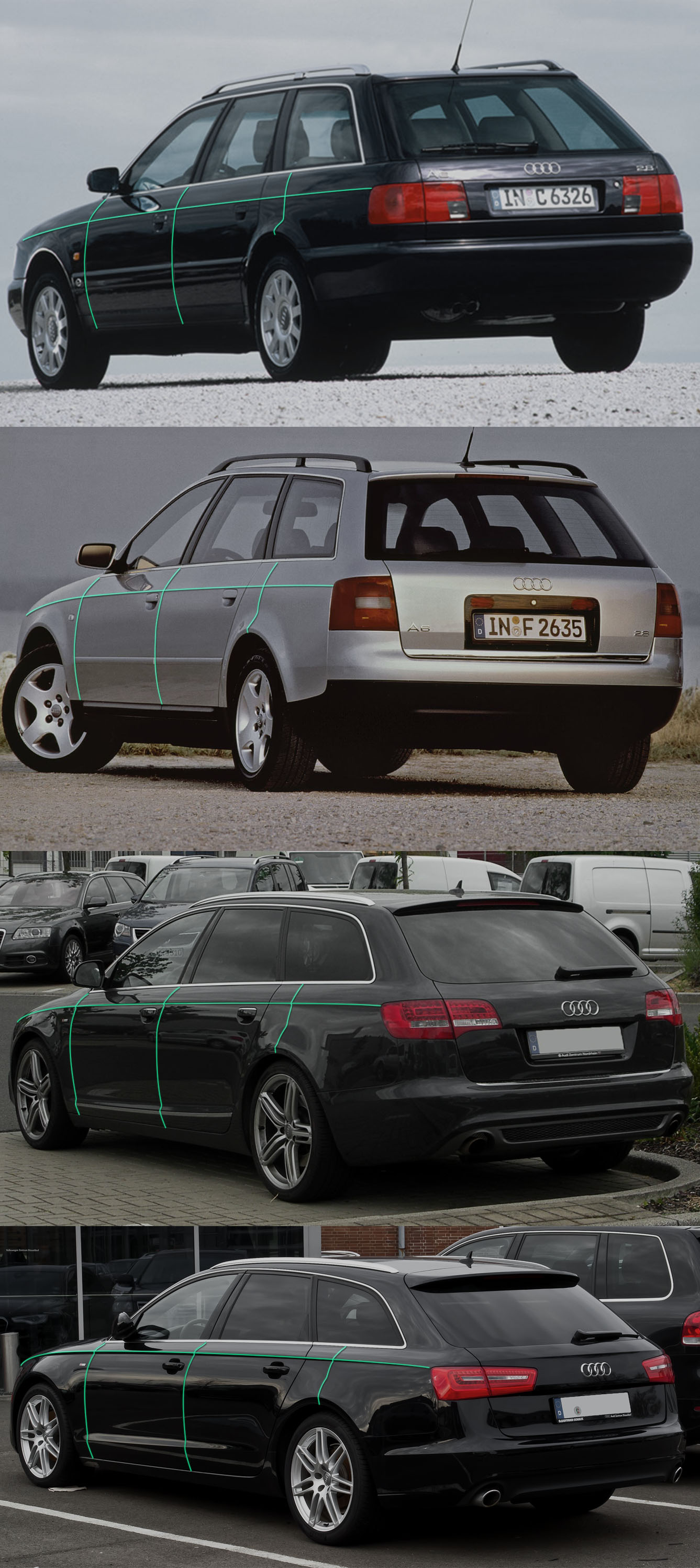
As is the way with Audi design, the technique here is subtle. You may need to zoom or enlarge the image above to see the profile shapes that the green lines describe. I have used the Avant version of the A6 to show more clearly a horizontal shoulder, without a c-pillar to blend into the rear wing. We can see from the very first A6 that the high and solid shoulder feature is part of Audi DNA. The surfacing is very simple, and quite soft in radii at changes of direction. See how the upper facing shoulder blends into the main door profile, then it very steadily curves towards the sill. The only negative curvature comes where the flared wheel arches extend from the main body surface. Next (silver car) we can see a small but significant tightening of the radii and surface definition. The 2nd generation A6 shows a sharper shoulder edge, and slightly more flare to the entire body (flare, like flared trousers). The sill position is further out, and the wheel arches have grown wider too. This car shows exceptional definition of the previously developed form language. A minimalistic and sharply defined design. Onto the 3rd generation and Audi are at this point trying to inject a little more dynamism and sportiness into their cars (oh dear..). They do this by going wide and low. The 3rd gen car is very wide and surfaces flare a lot towards the lower body. The door protecting body side strip is now out of fashion (and we all end up with dented doors?) and the sill is emphasised by being body colour (glossy, not matt) and the door surfaces actually waist inwards. The really significant, but very subtle update here is the “pinch” or crease, or more accurately an undercut appearing on that core shoulder transition line. Can you see the very small undercut there? A negative curvature surface, under that main shoulder surface change. The wheel arches are getting very flared now, like a sportscar. So this is the fashion, across the entire VW group in fact, for emphasising surfaces and their transition points (light/dark highlights concentrated) with a “pinch”. The latest Audi A6 is again evolutionary from the previous version, but the key part that has grown, is the pinch! That undercut has grown from being not just under the shoulder line, the radius has been drawn out from the bodyside because the shoulder surface above it is now negatively curved. The surface flows negatively (concave) into the base of the windows. This 4th gen (and 3rd) also has a subtle trick on the wheel arches, where the edge is again pinched to emphasise that edge as “sharp”.

The Cross Coupe at the top of the post has so many of these as I mentioned. Other car companies are doing this and using it to very dramatic effect. Meanwhile, Audi chose Geneva to continue previewing its future design direction with a Prologue concept car. This features razor-sharp surface radii, which seem to have backtracked slightly by using the “pinch” technique very very subtly in order to express sharpness. Concave or negative surfaces flowing into those edges are very subtle too. We don’t yet know if Audi will be able to mass-produce (metal stamp) these insanely sharp creases. Let’s hope so, as it’s a very nice feature.
So to talk about other companies following the form trend of BMW, Audi and VW we can take a look at a few concepts recently displayed by Infiniti and Chevrolet. Infinity and Lexus/Toyota are using sharp creased surfaces as important parts of their design language. The Infiniti QX30 concept crossover coupe is the latest (and almost production spec) design that shows their designers love affair with the very sharp body crease or pinch as we are calling it here. Just look at that edge that runs through the door handle. Amazing!  Here is Detroit’s latest design that uses the same surface treatment. The Chevrolet Bolt electric plug-in hybrid vehicle. The pinch line forms a strong part of the cars shoulder line, as it does on the VW Passat but this time the form continues on into the rear lamp shapes.
 Finally we can return to a VW group design product, which was announced in 2015. The new Skoda Superb. It demonstrates a dramatic example of the concave, negative shoulder surface (looks nice above the front wheel arch) that pinches into a sharp crease, with very strong and deep undercut for the side surfacing. The aim here from Skoda seems to be about giving the impression of flat surfaces that intersect sharply. They are aiming for a “creased” look to their cars and non-design savvy public are picking up on this prominent design “message”. This use of concave surfaces reminds very heavily of Bangle’s E61 BMW 5-series, from 10 years ago!
(EDIT) Some industry insider info has been passed to me recently- and it is a fact- that this very sharp crease (or draw in the panel stamping) is patented VAG technology. No other manufacturer currently has this extreme level of sharpness available to them. Very interesting, and no surprise that all VAG brands are making use of this design advantage.
 Well there we have it, watch out for the “pinch” effect on other cars. It really is very common, across cars from all brands and all market segments. To end I will add a gallery of images that formed the basis for this article.


_–_Heckansicht,_11._Februar_2013,_Düsseldorf")


Leave a comment